Stradom, a company at the forefront of the security and cleaning industry, underwent a transformative rebranding to revitalize its corporate identity. The challenge was to distill the essence of Stradom’s services into a modern, cohesive brand image that communicates reliability and efficiency.
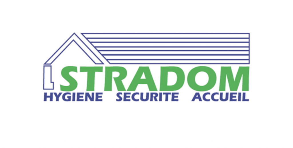
Before: The original Stradom logo featured a house icon, underscored by three stripes, and flanked by the words ‘Hygiene,’ ‘Security,’ and ‘Welcome’ in French. While it aimed to represent the company’s comprehensive services, the complexity of the design diluted its impact and memorability.
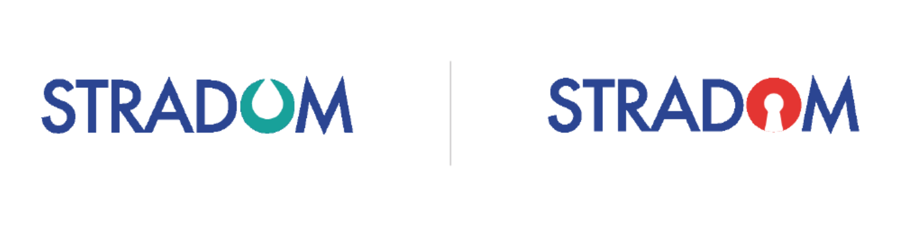
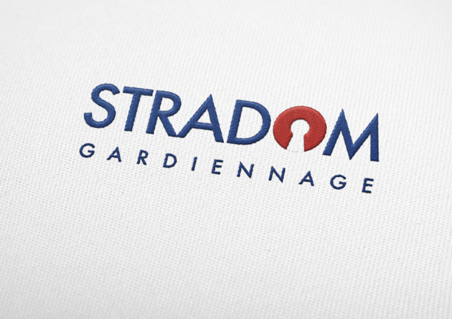
After: The rebranding strips away the excess to focus on a sleek, typographic solution. The new Stradom logo is a masterclass in minimalism, featuring a bold sans-serif font with a vibrant color scheme. The ‘O’ is cleverly designed to incorporate a keyhole symbol, subtly hinting at the security aspect of Stradom’s services, while the cleanliness aspect is communicated through the crispness of the design itself. The before and after contrast showcases a shift from a literal representation to an abstract, conceptual approach, marking Stradom’s evolution and readiness to stand out in today’s market.
This rebranding effort has not only modernized Stradom’s appearance but also sharpened its messaging, ensuring that the brand’s core values of safety, cleanliness, and welcoming service are front and center.